In the first tutorial, we visualized our customers' data in the map. We added a simple metric and a simple indicator which worked with one dataset.
...
| Name | Title | Data type |
|---|---|---|
transaction_id | Transaction ID | integer |
customer_id | Customer ID | integer |
store_id | Store ID | integer |
date | Date of the transaction | date |
amount | Transaction amount | decimal |
day_index | Week day index | integer |
day_name | Week day | string |
hour | Hour index | integer |
time_category | Time category | string |
channel | Channel (online/offline) | string |
...
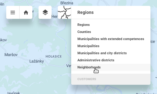
Open the Business overview view and see that the granularity has changed. Administrative units usually have multiple levels. By default we see the biggest level - Regions. Change the granularity to Neighborhoods in the granularity drop down menu in the upper left corner.

Visualize the Turnover value indicator to see the turnover aggregated to the Neighborhoods.
...